The Code
[style*="--aspect-ratio"] > :first-child {
  width: 100%;
}
[style*="--aspect-ratio"] > img {
  height: auto;
}
@supports (--custom:property) {
  [style*="--aspect-ratio"] {
    position: relative;
  }
  [style*="--aspect-ratio"]::before {
    content: "";
    display: block;
    padding-bottom: calc(100% / (var(--aspect-ratio)));
  }
  [style*="--aspect-ratio"] > :first-child {
    position: absolute;
    top: 0;
    left: 0;
    height: 100%;
  }
}
Source: https://css-tricks.com/aspect-ratio-boxes/
How To Install/Use On Oxygen Builder
This is standard CSS code so copy and paste from this website directly into a stylesheet in the Oxygen Builder. You can also use Advanced Scripts to insert it into your website.

Then, create a div, and give it a width of 100%. Remember, this is responsive, so we will not be using pixels for any of these elements.
Now, the final step is applying a data attribute. Go to the advanced tab, scroll all the way down, and click on attributes. Add a single attribute with the following information.

Name= “style”
Data= “--aspect-ratio:1/1;”
Once you’ve entered the necessary text, click apply attribute, and your div will now have an aspect ratio that doesn’t change even as the screen size does.
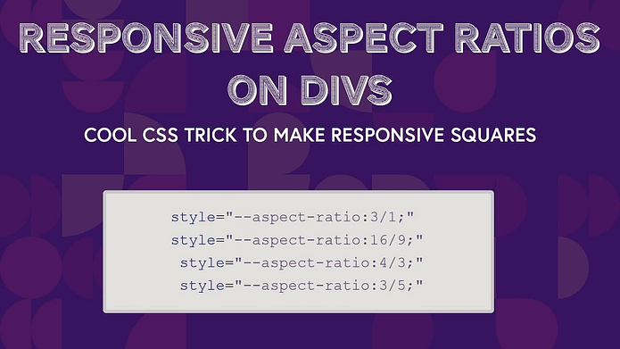
Change the aspect ratio to anything that you want. The example above gives you a square responsive give in the Oxygen Builder. Here are a few aspect ratios that you can use:

Also because it’s calculated, you can do this too:
Data= “--aspect-ratio:1.5;” - same as 3:2
Data= “--aspect-ratio:3523/2811;” - direct match to pixels