muse

SEO in Adobe Muse (Search Engine Optimization)

As an increasing number of great websites made with Adobe Muse pop up all over the web, occasionally I see designers missing one of the most critical factors in building and launching a successful website – SEO, which stands for search engine optimization.  For print designers new to the web, there are a few essential tasks that you must do in order to help search engines understand the structure of your website, and identify keywords that could yield a stream of search traffic.

1. Metadata

Within every Muse website, designers have the ability to input specific metadata that is unique to each page on the site.  This metadata includes the webpage title, description, and keywords, which are all important factors in how your site appears in search results.
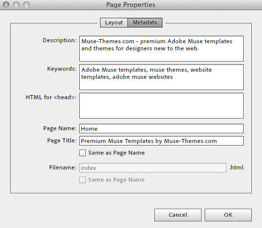
Metadata in Adobe Muse

On a specific page of your Muse site, click PAGE > PAGE PROPERTIES > METADATA

Description: include a brief description of what your site is all about.  Try and use keywords that are relevant to your site’s content, and be sure to keep this description brief.  150-160 characters is said to be ideal, so keep it short and powerful.  Make sure your description accurately describes what is on the webpage – don’t try and trick Google by stuffing this full of keywords.

Keywords: this isn’t as essential as the meta description, however it’s still helpful to include relevant terms to your websites content.  Don’t bother piling this full of 1,000 keywords and phrases.  It won’t help your rankings.

Page Title: When editing the page title settings, be sure to uncheck “same as page name”.   The page name is what Adobe Muse will call your page within it’s site plan, as well as on the navigation bar. The page title however is what search engines will read, and what will display in the top of your browsers window.  Your page title should briefly describe the content of the page – users want information fast when browsing the web, so don’t try and make them read any more than they have to.

I can’t stress enough, the reason Google is a great search engine is because it truly gives you relevant, quality results for your search. If it was possible to trick it into displaying any average website, nobody would use Google because it returned garbage results.  Focus on making the site easier for users to navigate and understand, and the search engines will appreciate it.

2. Headings

Websites are built with a specific hierarchy of information, and search engines look for this structure to understand the content of your site.  You’re probably using descriptive titles and headings within your site (if not, you should be!) however unless you’ve mapped those headings to a “Headline Style” then your efforts will be significantly diminished.
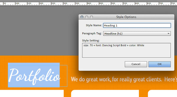
Heading 1 Tag Muse-Themes.com

Here’s how to set a proper heading style:

  • Create and style a new block of text, that contains your section heading (e.g. ABOUT US)
  • Highlight the text, and create a new paragraph style for the text.  Give it a name such as “Heading 1”
  • Within the style options dialog box, select the dropdown menu titled “Paragraph Tag” and choose an appropriate heading style to map it to.  In this example, we should pick Headline 1 (h1).
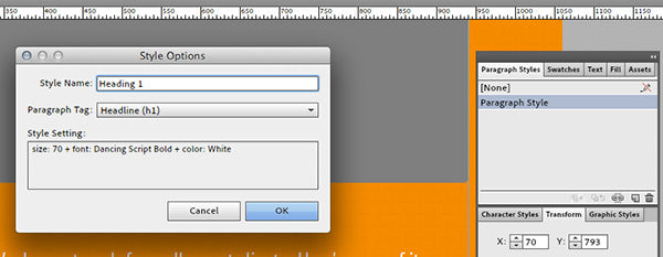
Style Options in Muse

The next time Muse outputs the code for your website, it will generate the proper HTML tags that let search engines know to reference this block of text as a true headline.


3. Alt Text and Image Titles

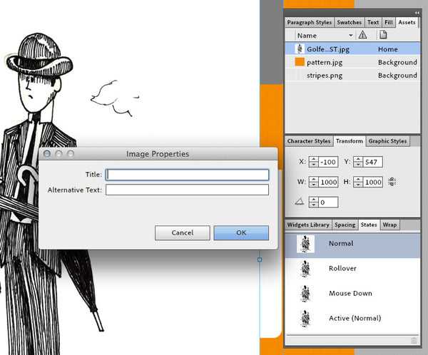
When placing images in Muse, you need to go one step further and assign a title and brief description of each image within the website.  After placing an image, right click (control-click) and select “Add Title”.  This brings up the image properties dialogue box, where you can provide some brief information about what the image is about.

Image Title: this is a straightforward description of the image.  It should follow the same guidelines as other titles – keep it brief, concise and accurate.  Most browsers will reveal this text if you hover over an image with your cursor.
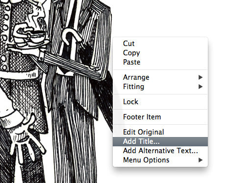
Add Title to Images Muse SEO

Alt Text: the alt text is intended to help users who may not be able to see the image to understand what it is all about (perhaps due to a visual impairment).  While it’s not as essential as the headline tags or metadata, Google does crawl alt text and you should try and include it where possible.
Title Images - Muse-Themes.com


Image Optimization

One of the most important elements on your website are the images. Yet, search engines do not have eyes to analyze the images or categorize them for image search results. Therefore, you need to consider applying SEO techniques to optimize the graphic elements of the website.

While the image file name should be descriptive, the Alt tag and Tooltip are also important bits of information to add to the images. The Alt tag lets you add a description of the image in a few words, so the search engine crawlers can understand and categorize the image based on the Alt information.

The Tooltip is a small text that appears when the site visitors roll over the image. This tip is important from the usability side which affects the general optimization of the website.

You can add the Alt and Tooltip in Adobe Muse by following these steps:

  1. Select the image from the layout
  2. Go to the Assets panel, right click the image and choose Image Properties
  3. Add the Alt and Tooltip text in the dialog box and click OK


4. Real text vs. images

In order for search engines to crawl your site and „read“ the written content, you need to make sure that you’re using as much real text (rather than images) as possible.  This might seem obvious for body copy, however with the addition of Typekit and web fonts within Adobe Muse, there is no reason why headings, navigation bars, and block quotes can’t also be styled using HTML text.

An easy way to test whether or not a search engine can crawl the text on your site is by trying to highlight and copy it into another document.  Images won’t let you select a specific word or letter (you can only save the entire image).  This was one of the early limitations in websites built entirely in Flash – text was enclosed inside a flash movie, and search spiders could not read any of the written content.

With the latest advancements in HTML / CSS and Adobe Muse, there’s almost nothing that you could do to an image button that you can’t do to a real text button.

Web Fonts, Web Safe Fonts or System Fonts?

There are 3 options for working with text in Adobe Muse. When it comes to Search Engine Optimization it’s best to use web fonts or web safe fonts. Here’s why:

Web Safe Fonts: Prior to the creation of services like Adobe Typekit, web designers were limited to using only the fonts that came preinstalled with a user’s specific operating system. These fonts had to be common between old and new versions of both Windows and Mac, leaving designers with only 5-10 good options for type. If you needed to use a specific typeface that wasn’t included with the OS (perhaps to meet corporate brand guidelines) your only option was to create an image from the text, and place that in your website. This violates the SEO best practice of using real text outlined above, and increases bandwidth use due to the image download.

The “web safe fonts” listed in Adobe Muse are the fonts that are commonly installed with modern operating systems.

Sticking with the limited web-safe list above will certainly test your creativity!

Web Fonts: Web fonts are a fairly recent development in web design, and they have given designers the ability to use custom or commercial fonts on websites without worrying about whether the visitor has it installed on their system. The use of web fonts can be achieved in a variety of ways (typically using CSS or Javascript) however the most popular method is through font subscription services such as Typekit. Web font service companies store these fonts on their own servers and your website will automatically access and download the font, which has been optimized for on screen display.

The “Web Fonts” listed in Adobe Muse are a collection of over 400 typefaces – they look great in all modern browsers, and are easily read by search engines.

Webfonts available directly in Adobe Muse – a really powerful feature!

System Fonts (exports as image): These are the fonts that a user has installed on their computer, and may not be common among all visitors to your website. When using a system font within Adobe Muse, the text will be automatically rasterized and converted to an image format when published. This means it cannot be indexed by search engines, and will increase website load times due to the file size of the image. The use of text images is often avoided in modern web design (due to the SEO & accessibility limitations), however there is still occasionally a use for it within certain applications (elaborate buttons perhaps).

For more information on Font options available in Muse, visit the following Adobe website:
http://www.adobe.com/products/muse/font-types.html

***

At the end of the day, having good quality relevant content will likely be the most essential factor in your search engine rankings. Write content with important keywords in mind, and keep your site current (update it regularly!).  SEO is a vast subject, and there a variety of tips and tactics that you can use to improve your rankings, however if you follow the tips above you should see a huge impact in your Muse websites rankings.

Always remember that Google’s job is to find the truth, and if you want your site to reach the top spot for a particular keyword, then you need to make sure it actually deserves to be there. 

Muse: Photoshop Buttons für Muse erstellen

How to Save Time When Adding Photoshop Buttons in Adobe Muse

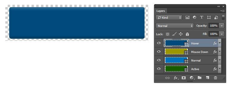
1creative-muse-photoshop-button-layers

1. Before you save the file in Photoshop, name each layer to represent its intended state: Normal, Hover (or Mouse Over), Click (or Mouse Down) and Active.

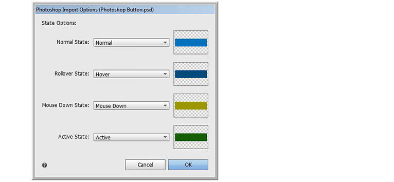
2creative-muse-photoshop-button-dialog 

2. When you import the file into Muse (File > Place Photoshop Button), the layers will automatically be assigned to the button states, regardless of the order that you saved them in Photoshop. It may only be saving you a few clicks but they soon mount up and it does mean you don’t have to remember which layer was which!

Muse: Rollende Akkordion-Texte Effekt

1. Create a new site in Muse.

I’m beginning with a new site here, note the Minimum Height setting has been increased to 1500px. This is to accommodate the amount of space needed for the scroll effects. This can also be adjusted in the Design View by dragging the Bottom of Page Guide down, or simply by adding elements to the content area, where Muse will push the footer area down for us.

1

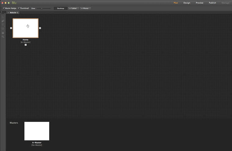
2. Open the Home page from the Plan View

Normally, we’d define the header and footer using the Master Page but as this is a simple example, we’ll jump straight onto the Home page and open it in Design View by double-clicking the page’s thumbnail in the Plan View.

2

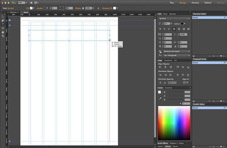
3. Create a text frame

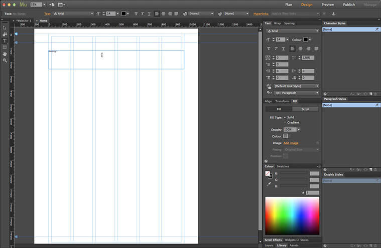
Here’s our page, with not a lot on it. We’ll use styled text frames for our headings, so we’ll start by grabbing the Text tool (keyboard shortcut: T) from the Toolbox. Click and drag a frame from the left edge of the content area, over to the far right of the content area. Don’t worry about the vertical position or the height for now, we can adjust them later.

3

4. Add text to the frame

For simplicity, I’m using the text Heading and the section number. Not very original, I know, but it gets the point across. The text is far too small, of course. We’ll fix that in a moment.

4

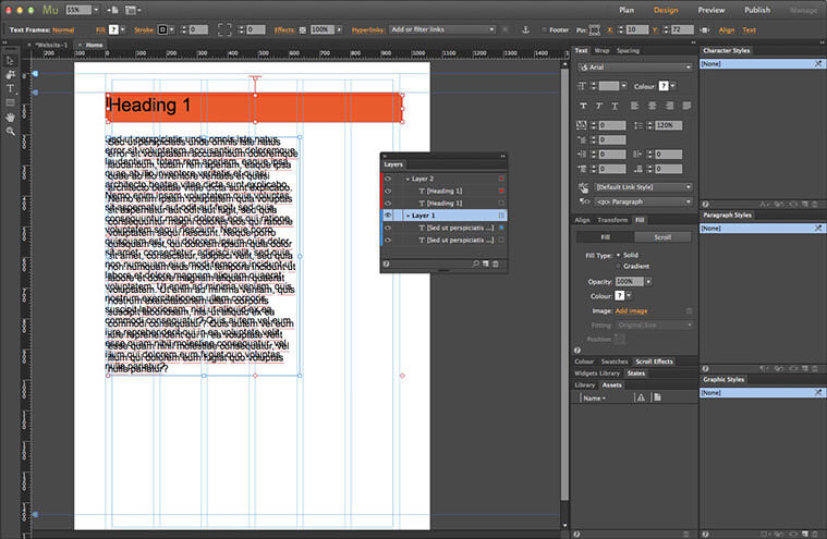
5. Select the text frame

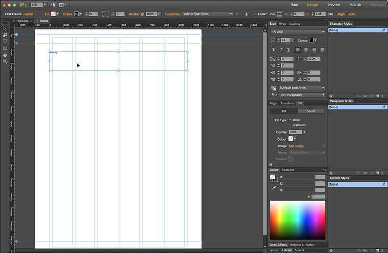
Now we’ll set the styling for our headings. Switch to the Selection tool (keyboard shortcut: V). This should automatically select the text frame but if not, click inside it. We can see the currently active object on the left of the Control Strip.

5

6. Set the background fill colour

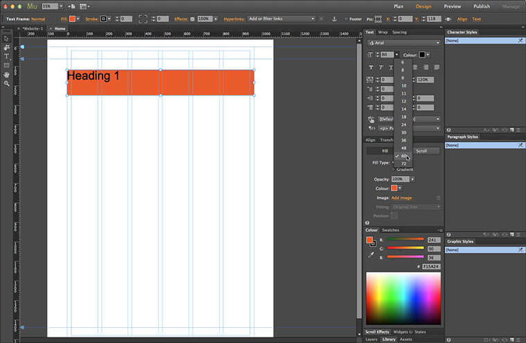
We’ll start off with the text frame’s background colour. This can be set either from the Fill Settings on the Control Strip, or from the Fill panel. I’m using shades of orange here, since they’re in a convenient order in the Swatch panel.

6

7. Set the text style

Now for the text. Go to the Text Options on the Control Strip, or use the Text panel. Again, we’ll keep things simple, so we’ll stick with the default font of Arial. We’ll need to make it larger, of course. A pixel size of 60px works well. We’ll also leave the colour as black.

7

8. Adjust the text frame’s size and position

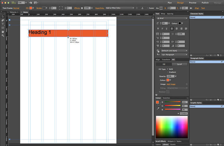
We’ll shrink the frame a little by clicking and dragging the frame’s bottom-middle handle up. I’ve set it to 86px here. Now move the frame up to meet the Header Guide. We can click and drag until it snaps into place, or use the Up Cursor Key to nudge it – holding the Shift key increments it by 10 pixels at a time.

8

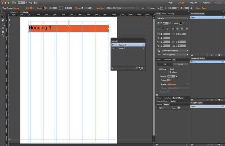
9. Create a new layer

Before we move on, we need to make sure that the headings will appear above the rest of the page content. The best way to do this is to place them on a separate layer. Open the Layers panel. Click the New Layer icon at the bottom of the panel. A new layer appears above the current layer. Note the colour chip on the left, we’ll see how this is relevant in the next step.

9

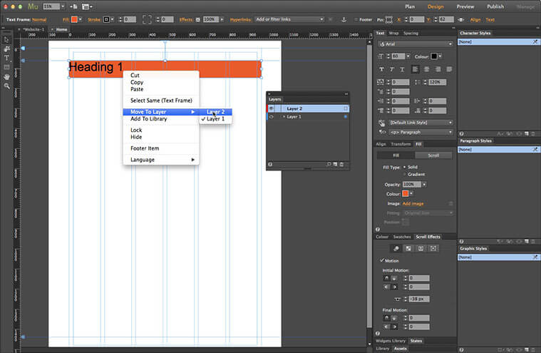
10. Move the content to a new layer

Right click on the text frame, or go to the Object Menu. Select the Move to Layer menu item and click Layer 2. Our text frame has been moved to the new layer; its frame border changes to reflect the label colour of the layer, red in this case. This can be really useful when you have a page with elements on several layers as it helps you to see the hierarchy at a glance.

10

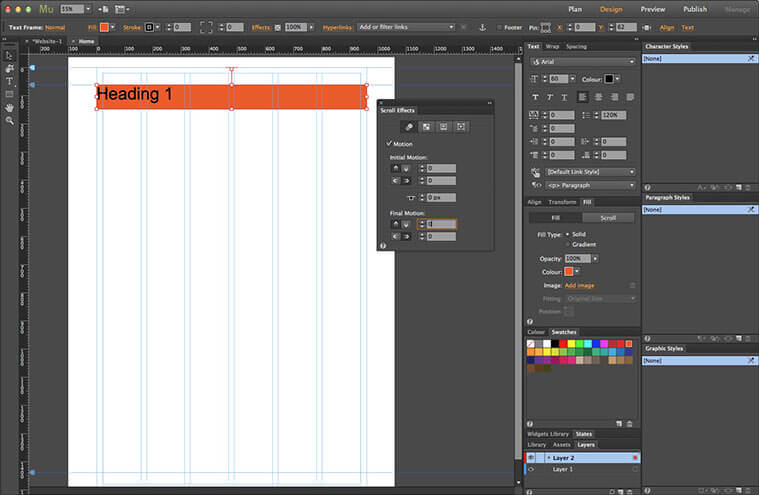
11. Define the heading movement

Now we can define the movement for the frame, which, since this is the first heading, won’t actually be moving at all. Open the Scroll Effects panel. Select the Motion Settings – this is the first option denoted by three cascading circles. Change both values for Initial Motion to 0. Set the Key Position to 0 (the top of the page). This can be done by either dragging the T-handle or by typing the value into the field. Set both values for Final Motion to 0 as well. This anchors the frame in a fixed position at the top of the page.

11

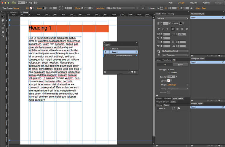
12. Add some content to the section

Now we’ll add some content to the page. Go back to the Layers panel. Click Layer 1 to make it the active layer. This will make sure the content sits beneath the headings. I’ve created a new text frame and filled it with place-holder text, just so we have some substance to show off the effect. The pixel size is 30px here.

12

13. Create a duplicate of the heading and content

To speed up our workflow, we can create a duplicate of the heading and content frames. Grab the Selection tool. Click the text frame we just created. Hold down the Shift key and click the heading frame. This selects both elements at the same time. Now go to the Edit menu and select Duplicate. We now have a copy of both objects; Muse helpfully offsets them slightly to make it easier to select and move the copies. If we open up the layer contents in the Layers panel we can see that Muse has retained the layer structure with the headings on Layer 2 and the text frames on Layer 1.

13

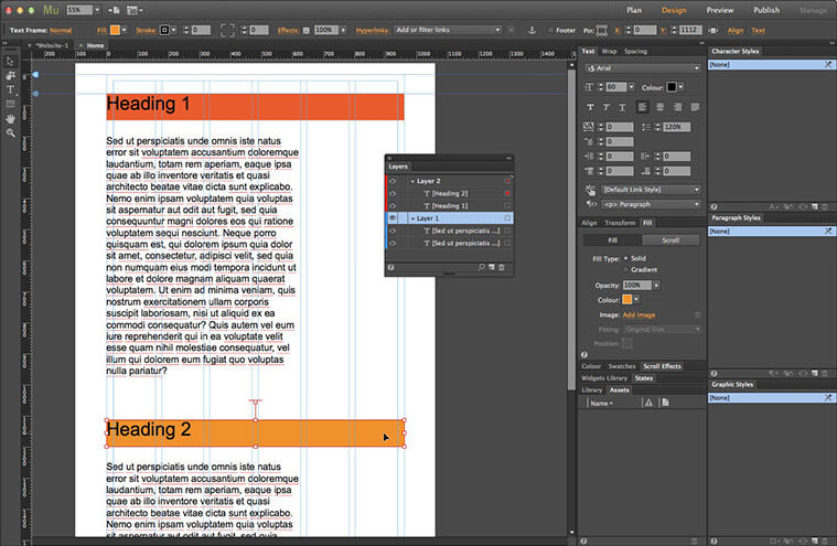
14. Change the second heading’s title and background colour

Double-click the new heading frame to make the text editable. Change the 1 to 2. Grab the Selection tool again. Now change the heading’s Fill colour to the next shade of orange in the Swatch list.

14

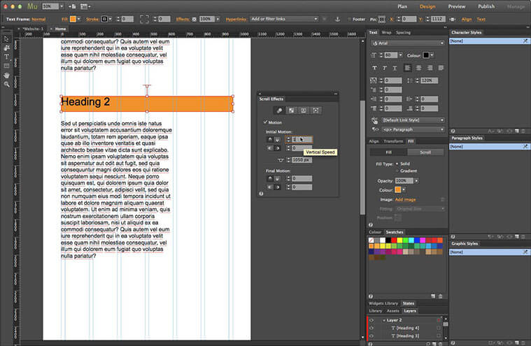
15. Set the new section heading’s scroll motion

We need to alter the motion settings for this heading, as we need it to move up as the page scrolls. Go to the Scroll Effects panel. Change the Initial Motion value to 1 px vertical, this will scroll the frame at the same speed as the rest of the content. Leave the Horizontal Movement at 0. Since we duplicated the first heading item, there’s no need to adjust the Key Position, as it will stop in exactly the same position, once it reaches the top of the browser. If we had created the object from scratch, it would have been necessary to work out the position by subtracting 62px – the distance between the position of first heading item and its Key Position – from the second heading’s position . Again, we need to leave both values for the Final Motion at 0 to stick it in place, once the Key Position reaches the top of the browser.

15

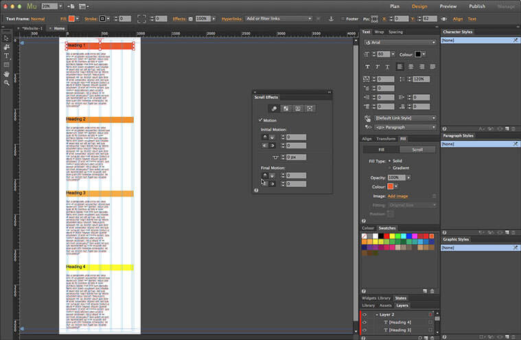
16. Add more content sections

Make a couple more duplicates of both the second heading and content frame as we did before – you can use the keyboard shortcut of Cmd+Opt+Shift+D (Mac) or Ctrl+Alt+Shift+D (PC) to speed up the process further. Change the text and colour, then move them into position down the page (shown here zoomed out to the full page). The correct Scroll Motion settings will be copied as before, so there’s no need to adjust them.


16 

17. Preview the effect

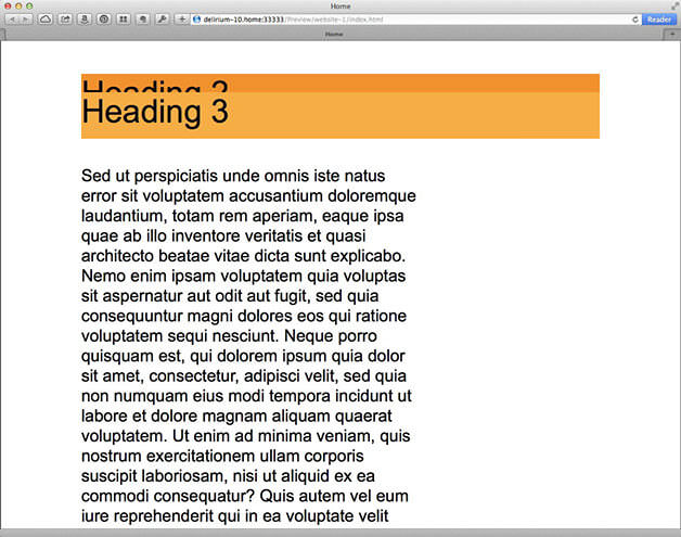
Go to the File menu. Select Preview Page in Browser. All being right, as you scroll the page, the headings will scroll up and stop when they reach the first heading, stacking up on top each time – this doesn’t translate well in a static image! We can see the text scroll past the heading here but ordinarily that would be hidden by the navigation menu or another page element.


That’s the basics of using Scroll Effects to create stacking headings in Adobe Muse. It’s worth noting that there has to be sufficient content on the page to allow every heading to reach the top; short pages may work on a laptop display but the headings may not reach their final position on a larger resolution device.

Click here for a live demo of the effect.

Adobe Muse: Full Width mit 50% Breite Farbaufteilung via Photoshop


1. Create a new document in Photoshop

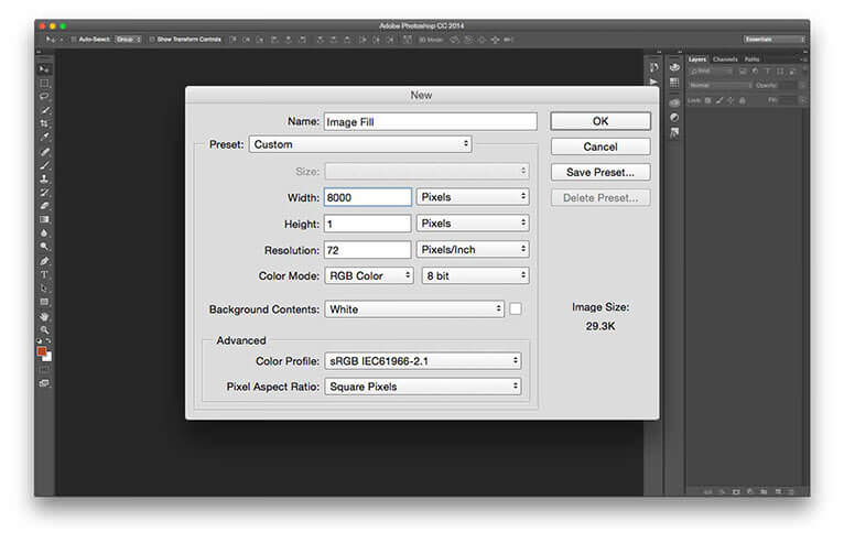
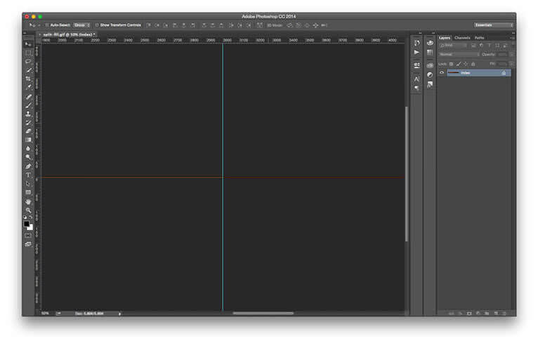
The first thing we need to do is create an image that will act as the fill background of our rectangle in Muse. Open Photoshop, Open the New Document dialog (File > New). We want to make sure the background image will fill any width of browser (and make it future-proof) so set the Width to something huge – 8000 pixels is a good figure. We’ll be using the vertical tiling option to fill the rectangle, so our height only needs to be 1 pixel. Click OK to create the document.

​An image showing a new document open in Photoshop CC.

1new-photoshop-document

2. The beginning of the new background image

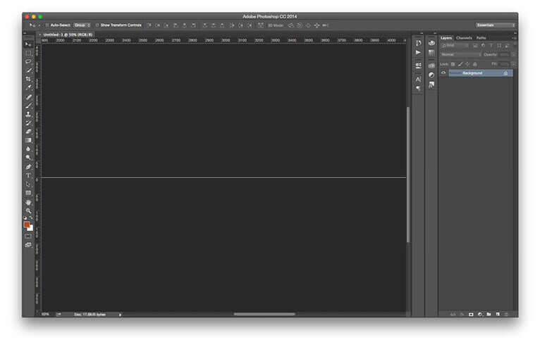
Here’s the basis for our background image. It doesn’t look like much at the moment, of course.

​An image showing the New Guide dialog in Photoshop CC.

2new-document-canvas

3. Create a guide

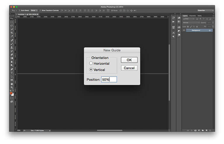
We need to make an exact 50/50 split. The best way to do this is create a guide. This way we’ll be able to snap to the centre of the document width. Go to View > New Guide. Set the Orientation to Vertical. Now type 50% into the Position box. Click OK to create the guide.
An image showing the Rectangular Marquee tool bing used to create a selection of half the image.

3create-guide

4. Create a selection

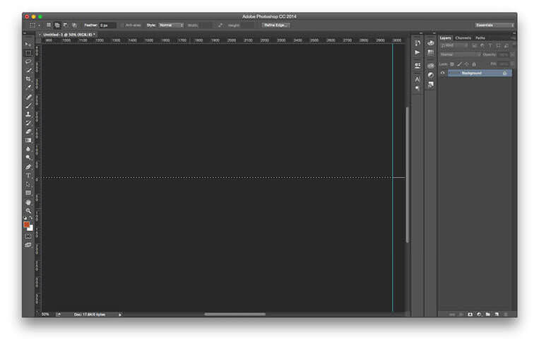
Next, we need to create a selection that spans the left half of the document. Grab the Rectangular Marquee tool (shortcut M). Position the cursor to the left of the centre guide. Click and drag out a selection over to the far left of the canvas, making sure that it’s completely selected; it might be necessary to scroll the workspace as you drag. Release the mouse to create the selection.

4first-selection

5. Fill the first half

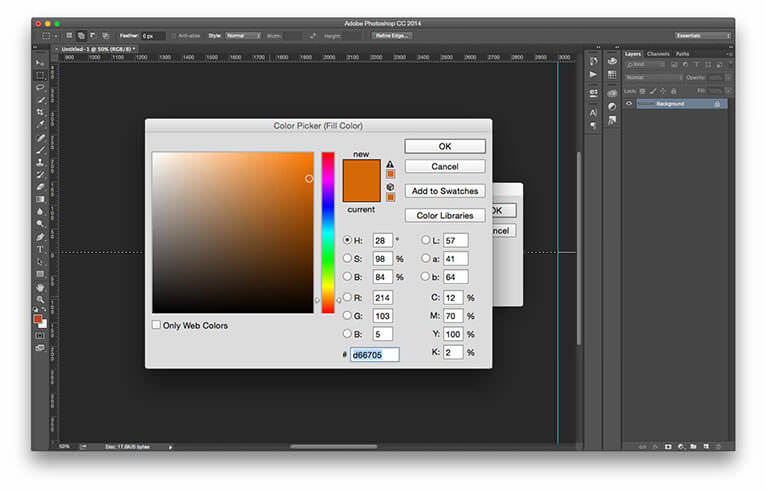
Next, we need to fill the selected area with our first colour. Go to Edit > Fill (oder rechte Maustaste – Fläche füllen… – Farbe). Set the Contents to Color. The Color Picker dialog opens. Choose your first colour, I’ve decided on a fiery orange. Click OK to accept the colour choice, then OK again to fill the area with colour.

​An image showing half of the document filled with colour.

5pick-first-colour


6. The first half complete

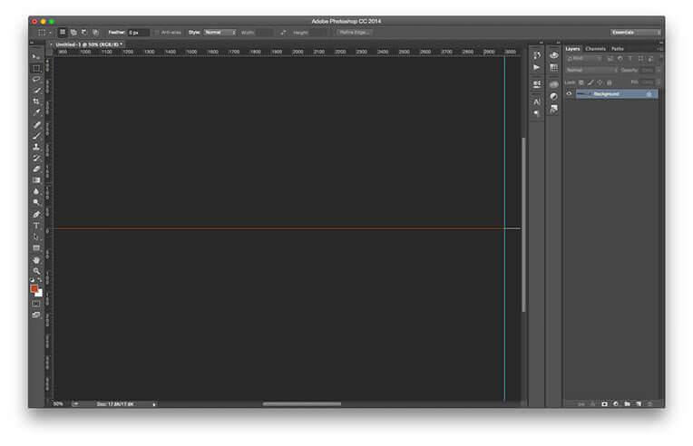
Clear the selection (Select > Deselect). Here’s how our image looks so far with exactly half of it in orange,
​An image showing the color picker being used to choose the colour for the second half of the image.

6left-side-filled


7. Fill the second half

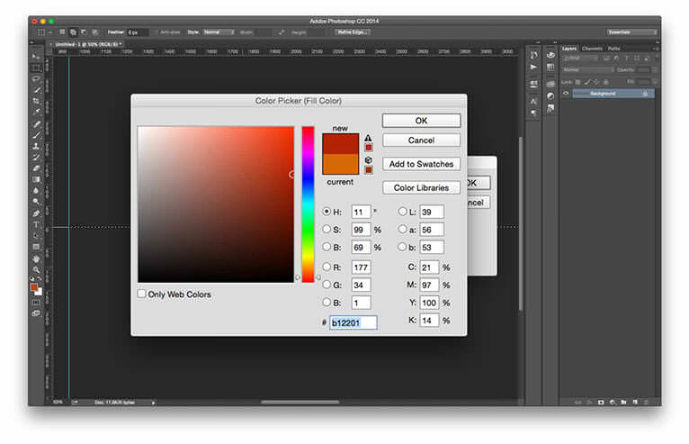
Repeat steps 4 and 5, this time creating the selection across the entire right side of the document. Select a different colour for the section – you’ll probably need to click twice on the Contents setting to bring up the color picker – I’ve used deep red in this case.
​An image showing the completed image in Photoshop.

7second-selection


8. The completed document

Clear the selection as before. This is how our finished image looks with an even split of 50% orange and 50% red.
​An image showing the Save for Web dialog in Photoshop CC.

8fifty-fifty

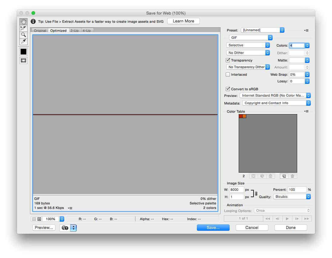
9. Save the image

We need to save the image to use in Muse, of course. Go to File > Save for Web. Since we only have two colours, we can save the file in GIF format. This will maintain the sharpness of the image as well as keeping the file size to a minimum. Select No Dither to prevent any anti-aliasing. The rest of the settings can be left at their defaults. Click Save to save the file to the location of your choice.
​An image showing a 100% width rectangle being drawn in Muse.

9save-for-web

10. Create a rectangle in Muse

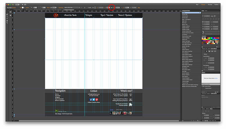
Now we can set about creating our design element. Switch back to Muse, Grab the Rectangle tool (shortcut M). Draw out a rectangle on the page at the required height and position. Click the 100% Width button on the Control Toolbar (circled in red) to set the rectangle to span the browser width.

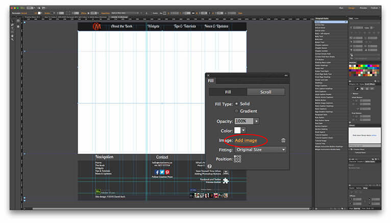
​An image showing the Fill panel in Muse being used to set the rectangle’s background fill image.

10muse-rectangle-object


11. Set the rectangle background fill type

Open the Fill Panel. If it’s not showing, you can open it from the Window Menu. Click the Add Image button. Select the image we created from its save location. You probably won’t see the single row appear at the top of the rectangle but it is there.
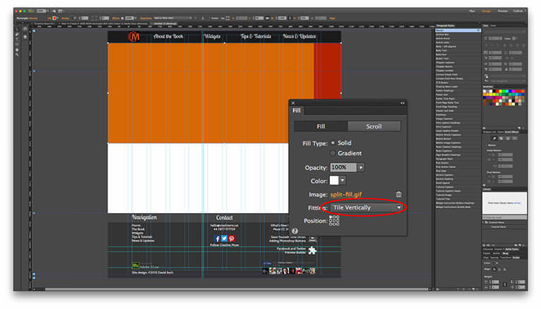
​An image showing the Fitting style being set in the Fill panel of Muse.

11set-fill-image


12. Change the background image fitting type

Next, we’ll set the fitting type. This determines how the rectangle is filled. Change the option to Tile Vertically. The rectangle is now filled from top to bottom with the image. As you can see, we’re not quite there yet.
​An image showing the background image position being set to top-centre in the Fill panel of Muse.

12tile-vertically

13. Centre the background image

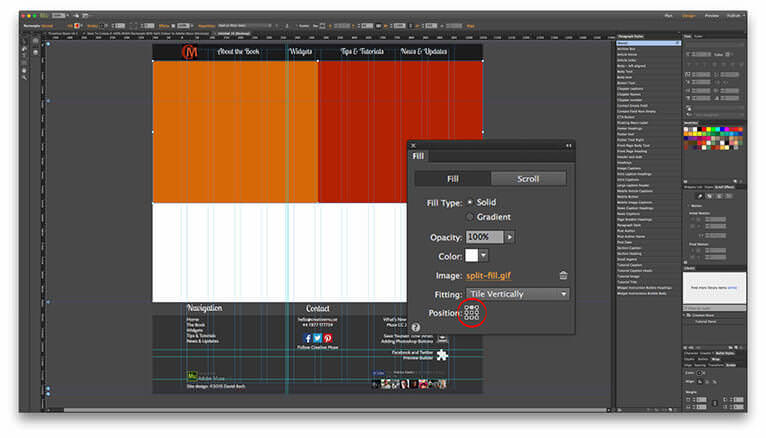
The final part of the technique is to ensure the background image is centred. Click the top-middle square on the Position grid. The background now snaps into place with the split in the dead centre of the page.
​An image showing a preview of the technique in the browser at two different widths.

13background-centred

14. The completed technique in preview

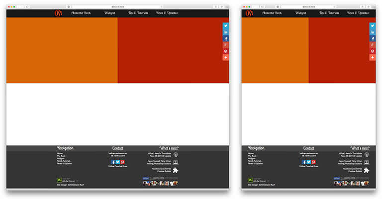
That’s the technique completed. As the screenshots show here, we have our 100% width design element with a perfect 50/50 colour split.

I hope you find this tutorial useful in your own projects. If you have any questions or comments, please feel free to do so below and if you like it, I’d really appreciate if you would share it.

14browser-previews

Adobe Muse HiDPI


HiDPI steht für „High Dots Per Inch“ (hohe Punktzahl pro Zoll) und bezeichnet Bildschirme mit hoher Pixeldichte oder einfach hoher Auflösung. Mit höherer Pixeldichte können HiDPI-Bildschirme Text und Grafiken detailgenauer anzeigen als Standard-Displays. Beispielsweise kann das Retina-Display von Apple, das mit iPhone, iPad, iPod touch usw. verfügbar ist, Text und Grafiken mit hoher Auflösung anzeigen.

In Adobe Muse erstellte Web-Designs können alle Vorteile der Anzeigequalität von hochauflösenden (HiDPI-) Bildschirmen, wie Apple-Retina-Displays, nutzen.

Zeigt die Differenz zwischen Pixeldichte des Standards (links) und HiDPI (rechts).

HiDPI in Muse zu nutzen ist ganz einfach:

  • Ändern Sie Auflösungseinstellung der Site zu HiDPI
  • Erstellen Sie Bilder, die mindestens zweimal (2x) so groß sind wie auf der Site angezeigt

Wenn Sie eine HiDPI-Site aus Muse hochladen oder exportieren, enthält der generierte Code Bilder in Standardgröße und doppelter Größe und erkennt automatisch, welche Bilder verwendet werden sollen, wenn die Site auf einem HiDPI-Display oder einem Display mit Standardauflösung angezeigt wird.

Aktivieren von HiDPI in Adobe Muse

Über das Menü zur Auflösung im neuen Site-Dialogfeld haben Sie die Möglichkeit, zwischen HiDPI (2x) und Standard auszuwählen.

Auflösungsoption im Dialogfeld „Site-Eigenschaften“

Sie können die Auflösungseinstellung ändern, nachdem Sie eine Site erstellt haben, indem Sie „Datei“ > „Site-Eigenschaften“ auswählen.

Erstellen von Elementen mit 2x-Bilddaten

Um alle Vorteile von HiDPI-Bildschirmen nutzen zu können, müssen die Elemente für eine Anzeige mit höherer Qualität eine höhere Auflösung haben. Die Größe eines Elements muss mindestens das Zweifache der Größe betragen, die auf der Website angezeigt werden soll.

2x-Bilder zu erstellen ist ganz einfach. Ein 2x-Element muss mindestens die doppelte Anzeigegröße haben als die Größe, die auf dem Bildschirm angezeigt wird. Beispiel:

Wenn Sie ein HiDPI-Element auf der Webseiten-Leinwand platzieren, optimiert Adobe Muse das Bild, indem die Größe auf 50 % reduziert wird. Die Reduzierung der visuellen Größe wird vorgenommen, um ein glatteres und effizienteres Gestaltungserlebnis zu ermöglichen. Solche Bilder werden im Elementebedienfeld durch „2x“ gekennzeichnet. Beachten Sie, dass Adobe Muse Daten des Originalelements beibehält, um eine höhere Pixeldichte bereitzustellen, wenn das Element auf einem HiDPI-Bildschirm angezeigt wird. Gerasterter Text sowie Effekte, die als Bilder ausgegeben werden, werden automatisch beim Veröffentlichen oder Exportieren mit 2x- und Standardgröße generiert.

Öffnen Sie das Elementebedienfeld („Fenster“ „Elemente“), um sicherzustellen, dass Ihre Elemente 2x-Elemente sind und ausreichend Daten für die Anzeige mit höherer Qualität enthalten. Wenn ein Element genügend Daten enthält, wird das Symbol 2x daneben angezeigt. Wenn das 2x-Symbol nicht neben Ihrem Element angezeigt wird, enthält es nicht genug Daten, um mit der höchsten Qualität angezeigt zu werden, und wird in Standardauflösung angezeigt.

Exportieren von HiDPI-Bildern

Es gibt Sonderfälle, in denen Adobe Muse kein Bild mit hoher Auflösung als Bild mit 2x-Daten exportiert. Wenn Bilder auf die Größe von Containern skaliert werden, bei Seiten mit Hintergrundbildern, Diashows im Vollbildmodus usw., exportiert Adobe Muse bei der Veröffentlichung keine HiDPI-Version des Bildes. Genauer gesagt wird in folgenden Situationen nur die Standardversion des Bildes exportiert:

  • 100 % Breite: Auf Seitengröße skalieren/Auf Fläche skalieren
  • Vollbild-Diashow: Auf Seitengröße skalieren/Auf Fläche skalieren
  • Browser/Seitenhintergrund: Auf Seitengröße skalieren/Auf Fläche skalieren
Beachten Sie außerdem, dass gekachelte Hintergrundbilder anders bearbeitet werden als Hintergrundbilder, für die „Auf Seitengröße skalieren/Auf Fläche skalieren“ ausgewählt wurde. Bei gekachelten Bildern stellt Adobe Muse beim Exportieren der Website sowohl Standardbilder als auch Bilder mit hoher Auflösung für Standard- und HiDPI-Bildschirme bereit.
Wenn Sie in Adobe Muse ein Bild mit hoher Auflösung mit 2x-Daten kacheln, wird es wie alle anderen Bilder behandelt und mit 50 % der Originalgröße auf der Webseiten-Leinwand platziert. Beim Exportieren wird das Bild mit halber Größe (50 %) in Standardauflösung und das native Bild mit hoher Auflösung mit 2x-Daten exportiert.

Berücksichtigen der Site-Besucher

Durch die HiDPI-Anzeige können Besucher Webinhalte in höchster Qualität anzeigen, da mehr Bilddaten verwendet werden. 2x-Bildgrößen führen zu Bilddateien, die vier Mal so groß wie ein Bild in Standardauflösung sind. Um HiDPI-Bilder ansehen zu können, müssen Site-Besucher 4-Mal mehr Daten laden. Damit Inhalte schneller auf HiDPI-Seiten angezeigt werden, exportiert Muse HiDPI-Elemente und Elemente in Standardauflösung. Die Elemente in Standardauflösung werden zuerst geladen und die HiDPI-Elemente werden zusätzlich zu den Standardversionen progressiv geladen.

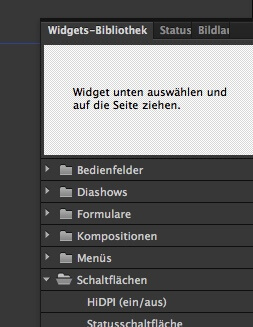
Das HiDPI-Schaltflächenwidget (ein/aus)

Für einige Besucher Ihrer Site ist das progressive Laden sehr praktisch. Für Besucher mit begrenzten Datenmengen oder anderen Verbindungen mit eingeschränkten oder teuren Downloadkontingenten kann diese Lösung jedoch problematisch sein. Für diese Site-Besucher haben Sie die Möglichkeit, das HiDPI-Schaltflächenwidget (ein/aus) hinzuzufügen. Wenn die HiDPI-Schaltfläche (ein/aus) auf einer Seite platziert wird, lädt diese Seite zunächst nur die Standardauflösung und die HiDPI-Schaltfläche wird als deaktiviert angezeigt. Wenn der Besucher dann die HiDPI-Schaltfläche aktiviert, laden alle Seiten, die eine HiDPI-Schaltfläche (ein/aus) enthalten, ab diesem Punkt HiDPI-Bilder, bis der Besucher der Site HiDPI deaktiviert, den Browser schließt oder Cookies löscht. Seiten, die keine HiDPI-Schaltfläche (ein/aus) enthalten, laden immer HiDPI-Bilder, wenn sie auf einem HiDPI- oder Retina-Bildschirm angezeigt werden. Wird die Site nicht auf einem HiDPI-Bildschirm oder Retina-Gerät angezeigt, ist die Schaltfläche in einem nicht verfügbaren Status und nur Bilder in Standardauflösung werden geladen.

screenshot_0559

Adobe Muse und Parallax

Parallax-Beispiele, um die Objekt-Bewegung zu verstehen


screenshot_74


0 = fixiert = gleiche Scrollgeschwindigkeit

1 = Bewegung

Man muss beim Anlegen von Parallax die Hintergrund-Grafiken weitgehend vergessen und sich am Browser und der Mausbewegung orientieren. Das ist das große „Umdenken“.


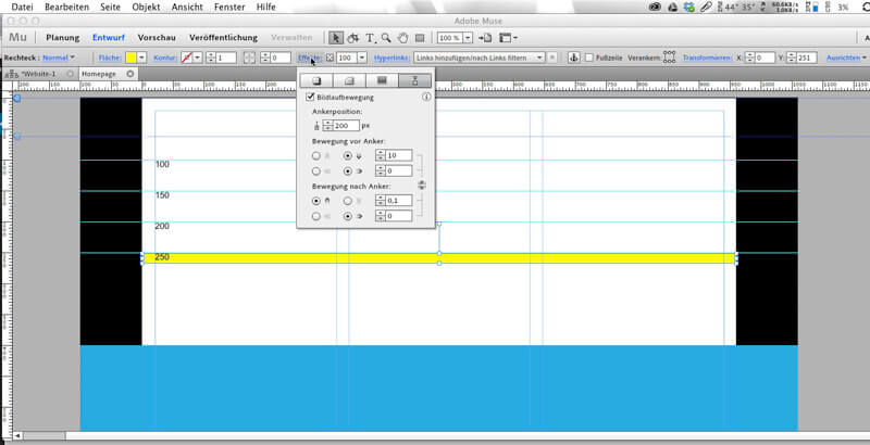
100 (zu 250)/ 0 – 0 – 0 – 0DIV fixiert bei 150 und schwebt unbewegt. Hier ist also nur ein 150 Px-Abstand nach oben festgelegt
0 / 0 – 0 – 0 – 0DIV fixiert auf 250 und schwebt unbewegt
100 (zu 250) / 1 runter – 0  – 1 runter – 0wenn Browser bei 100, dann schiebt er sich auf Pos 250, wie im Entwurf gezeigt. Dann schiebt er sich nach unten raus.
100 (zu 250) / 1 runter – 0 – 0 – 0
wenn Browser bei 100, dann schiebt er sich auf Pos 250, wie im Entwurf gezeigt. Anschließend bleibt er bei 250 fix stehen
100 (zu 250) / 1 runter – 0 – 0,5 hoch – 0 Balken ingendwo oben sichtbar. Wenn bei 100, dann rutscht er auf 250 und bewegt sich dann langsam hoch
 240 (zu 250) / 10 runter – 0 – 0 – 0 Der Balken ist zuerst nicht sichtbar. Bei 240 ist er plötzlich da und bleibt 10 Px von oben fest kleben. Kurzer Weg von 240 auf 250 und schnelle Mausbewegung – also schnelles Einblenden
 240 (zu 250) / 10 runter – 0 – 0 – 1 Der Balken ist zuerst nicht sichtbar. Bei 240 ist er plötzlich da und wandert dann mit der Maus nach unten.


Keyposition in Parallax mit Adobe Muse

[youtube_sc url=“http://www.youtube.com/watch?v=5OOLEztI-so“ autohide=“1″ fs=“1″ iv_load_policy=“3″ rel=“0″ showinfo=“0″]

[youtube_sc url=“http://www.youtube.com/watch?v=3wD72dFDq9Q“ autohide=“1″ fs=“1″ iv_load_policy=“3″ rel=“0″ showinfo=“0″]

[youtube_sc url=“http://www.youtube.com/watch?v=L02BfHdNLFo“ autohide=“1″ fs=“1″ iv_load_policy=“3″ rel=“0″ showinfo=“0″]


Byrdie Template

[youtube_sc url=“http://www.youtube.com/watch?v=uyyAA43fLFg“ autohide=“1″ fs=“1″ iv_load_policy=“3″ rel=“0″ showinfo=“0″]


Nightlight Template

[youtube_sc url=“http://www.youtube.com/watch?v=KJMi5l9Ru-g“ autohide=“1″ fs=“1″ iv_load_policy=“3″ rel=“0″ showinfo=“0″]

Hintergrundbilder, die überscrollt werden:

Rechteck aufziehen 100% breit, Fill mit Foto, Fill mit Scroll 0 / 0 / 0 / 0 versehen. Somit wird das ganze Foto in den Hintergrund gelegt, festgenagelt und die durchsichtige Rechteck-Maske fährt drüber und macht Ausschnitte des Fotos sichtbar.


Wechselnde Überschrift zu scrollendem Text

[youtube_sc url=“http://www.youtube.com/watch?v=wAHbJa-AvIA“ autohide=“1″ fs=“1″ iv_load_policy=“3″ rel=“0″ showinfo=“0″]

Langsam bewegender Browser-Hintergrund

[youtube_sc url=“http://www.youtube.com/watch?v=pXS1rLhcLvw“ autohide=“1″ fs=“1″ iv_load_policy=“3″ rel=“0″ showinfo=“0″]

Browserfill – Bild auswählen. Mit Scroll-Effekt versehen – nach oben < 1
(wenn Scroll = 0, dann bleibt das Bild stehen und der Text wischt drüber)


Muse 7.0: Dynamisch wechselnder Hintergrund

[youtube_sc url=“http://www.youtube.com/watch?v=N0A0bdjpMrI#t=1″ autohide=“1″ fs=“1″ iv_load_policy=“3″ rel=“0″ showinfo=“0″]


Horizonal scrollende Website

[youtube_sc url=“http://www.youtube.com/watch?v=diUtfwFGI1w“ autohide=“1″ fs=“1″ iv_load_policy=“3″ rel=“0″ showinfo=“0″]


Background Image

[youtube_sc url=“http://www.youtube.com/watch?v=FnhG27NsfGE“ autohide=“1″ fs=“1″ iv_load_policy=“3″ rel=“0″ showinfo=“0″]

[youtube_sc url=“http://www.youtube.com/watch?v=g7Vpdg-q6IQ“ autohide=“1″ fs=“1″ iv_load_policy=“3″ rel=“0″ showinfo=“0″]

Muse 7.0: 100% Parallax Scrolling Image Fill

[youtube_sc url=“http://www.youtube.com/watch?v=FEiRwVMNBgU#t=12″ autohide=“1″ fs=“1″ iv_load_policy=“3″ rel=“0″ showinfo=“0″]


Vertikale Navigation

[youtube_sc url=“https://www.youtube.com/watch?v=dbLp_q9qwG8″ autohide=“1″ fs=“1″ iv_load_policy=“3″ rel=“0″ showinfo=“0″]


Muse 7.0: Der Opacity Scroll Effekt

[youtube_sc url=“http://www.youtube.com/watch?v=Cd0nzflGNc4#t=10″ autohide=“1″ fs=“1″ iv_load_policy=“3″ rel=“0″ showinfo=“0″]


Opening Door

[youtube_sc url=“http://www.youtube.com/watch?v=9kqrjoivJXE“ autohide=“1″ fs=“1″ iv_load_policy=“3″ rel=“0″ showinfo=“0″]


Muse 7.o: Auto Fading Design Elemente

[youtube_sc url=“http://www.youtube.com/watch?v=pi6LStQB854″ autohide=“1″ fs=“1″ iv_load_policy=“3″ rel=“0″ showinfo=“0″]


Muse 7.0: Smooth Fading Rollovers

[youtube_sc url=“http://www.youtube.com/watch?v=qoC2FKdoVIg“ autohide=“1″ fs=“1″ iv_load_policy=“3″ rel=“0″ showinfo=“0″]


Bewegende und dann angepinnte Navigation

[youtube_sc url=“http://www.youtube.com/watch?v=eQo_k9WiLms“ autohide=“1″ fs=“1″ iv_load_policy=“3″ rel=“0″ showinfo=“0″]

Navi in einen „hohen“ Layer legen, damit immer sichtbar.

Navi mit Scroll versehen: 1 nach oben / 0 / 0 / 0
Die Keypositon muss am oberen Rand der Navi sein.

[youtube_sc url=“http://www.youtube.com/watch?v=cYYDXAjnG4o“ autohide=“1″ fs=“1″ iv_load_policy=“3″ rel=“0″ showinfo=“0″]


Ankermenü: Aktive Hyperlinks bei Navigation über Ankerpunkte

[youtube_sc url=“http://www.youtube.com/watch?v=qNsI6DHz5Co“ autohide=“1″ fs=“1″ iv_load_policy=“3″ rel=“0″ showinfo=“0″]

Menü einfügen.
Wichtig: TYP = manuell

Hyperlinks-Linkstyle in den Seiteneigenschaften (Inhalt): Linkformate bearbeiten – „Aktiven Status für Ankerlinke aktivieren“ ankreuzen


Eigenes Menü erstellen – OnePage-Design

[youtube_sc url=“http://youtu.be/opLo4krsjnM“ theme=“light“ modestbranding=“1″ autohide=“1″ fs=“1″ iv_load_policy=“3″ rel=“0″ showinfo=“0″ hd=“1″]


Fade away Banner Image

[youtube_sc url=“http://www.youtube.com/watch?v=caVozfngfCM“ autohide=“1″ fs=“1″ iv_load_policy=“3″ rel=“0″ showinfo=“0″]

Gradient mit Speed 7 nach oben scrollen lassen, dann 0 / 0. Key Position etwa in der Mitte des Banner-Fotos. Der Gradient muß sehr lang nach unten sein, damit er alles überdeckt, was noch kommt.

Man kann die Box mit dem Banner-Foto auch noch mit 0,5 nach oben (anschließend 0/0) versehen), damit es sich ein wenig bewegt 😉


Photobox Effekt Gimmick

[youtube_sc url=“http://www.youtube.com/watch?v=dfEfyA6BMPc“ autohide=“1″ fs=“1″ iv_load_policy=“3″ rel=“0″ showinfo=“0″]


Hero Slider

[youtube_sc url=“http://www.youtube.com/watch?v=-ZWIU_1fNOQ“ autohide=“1″ fs=“1″ iv_load_policy=“3″ rel=“0″ showinfo=“0″]

Bildershow übereinander slidende Image Masks

[youtube_sc url=“http://www.youtube.com/watch?v=8m2Lg241e3A“ autohide=“1″ fs=“1″ iv_load_policy=“3″ rel=“0″ showinfo=“0″]

Boxen erstellen und mit Fotos füllen. Im Füllen-Dialog auf SCROLL gehen und auswählen 0 / 0 / 0 / 0.


Bildershow übereinander slidende Bilder-Panels

[youtube_sc url=“http://www.youtube.com/watch?v=8LR6Axwo1ao“ autohide=“1″ fs=“1″ iv_load_policy=“3″ rel=“0″ showinfo=“0″]

Bilder auf einer Seite untereinander platzieren.

alle Bilder auswählen und dieselben Scroll-Werte geben: 1 nach oben / 0 / 0 / 0

Die Keypositions müssen immer so gewählt sein, dass das untere Bild am oberen anschließt. Dazu muß die Keyposition jedes einzelnen Fotos angepasst werden.


Thumbnail Slideshow

[youtube_sc url=“http://www.youtube.com/watch?v=ufirlrzdtyA“ autohide=“1″ fs=“1″ iv_load_policy=“3″ rel=“0″ showinfo=“0″]

[youtube_sc url=“http://www.youtube.com/watch?v=5XIkXpW1GUg“ autohide=“1″ fs=“1″ iv_load_policy=“3″ rel=“0″ showinfo=“0″]


100% Slideshow Trick

[youtube_sc url=“https://www.youtube.com/watch?v=xZ7HP0RN0os“ autohide=“1″ fs=“1″ iv_load_policy=“3″ rel=“0″ showinfo=“0″]


Slideshow mit eingebettetem Video

[youtube_sc url=“http://www.youtube.com/watch?v=5in4swnIFsw“ autohide=“1″ fs=“1″ iv_load_policy=“3″ rel=“0″ showinfo=“0″]


Scroll activated Video

[youtube_sc url=“http://www.youtube.com/watch?v=rYwxyZuL-04″ autohide=“1″ fs=“1″ iv_load_policy=“3″ rel=“0″ showinfo=“0″]


Before and After Slider – Vorher-Nachher Widget

[youtube_sc url=“https://www.youtube.com/watch?v=p3hpvfgF6qA&html5=1″ autohide=“1″ fs=“1″ iv_load_policy=“3″ rel=“0″ showinfo=“0″]


Fliegender Text als  WELCOME-Seite

[youtube_sc url=“http://www.youtube.com/watch?v=CcX6p_a9jUc“ autohide=“1″ fs=“1″ iv_load_policy=“3″ rel=“0″ showinfo=“0″]

Das Welcome mit Link auf einen Anker versehen.

Der Anker sollte nach der Keyposition des Begrüßungstextes hindeuten.

Keypositionen des Textes alle gleich (hier im Beispiel auf 615). WICHTIG: Motion after Key: alles auf 0 setzten. Die Bewegung sollte vor der Keypostion stattfinden.


Foto überscrollen mit Foto-Sketch-Balken

[youtube_sc url=“https://www.youtube.com/watch?v=2xAgbDbraGw“ autohide=“1″ fs=“1″ iv_load_policy=“3″ rel=“0″ showinfo=“0″]


Konfigurator

[youtube_sc url=“http://www.youtube.com/watch?v=5e6QPcw9iJU“ autohide=“1″ fs=“1″ iv_load_policy=“3″ rel=“0″ showinfo=“0″]


Eigene Schriften hinzufügen

[youtube_sc url=“https://www.youtube.com/watch?v=RGv-KuqVKJ0″ theme=“light“ modestbranding=“1″ autohide=“1″ fs=“1″ iv_load_policy=“3″ rel=“0″ showinfo=“0″ hd=“1″]


Nike Text Effekt

[youtube_sc url=“http://www.youtube.com/watch?v=p82-uR95X0o“ autohide=“1″ fs=“1″ iv_load_policy=“3″ rel=“0″ showinfo=“0″]

Textstücke positionieren.

Mit Scroll-Effekt nach oben versehen. Keyposition ist 0!!!! Motion Key Before und After gleich setzen.


Tesla Timeline Effekt

[youtube_sc url=“http://www.youtube.com/watch?v=ySTroxpp6iw“ autohide=“1″ fs=“1″ iv_load_policy=“3″ rel=“0″ showinfo=“0″]

Grafik mit transparenter Timeline erstellen. Farbiges Rechteck versteckt hinter die Grafik klemmen und oben zentriert festpinnen / fixieren.


Muse 7.0: Der neue „State Button“

[youtube_sc url=“http://www.youtube.com/watch?v=wyzvtawrI8M#t=0″ autohide=“1″ fs=“1″ iv_load_policy=“3″ rel=“0″ showinfo=“0″]


Muse 7.0: Die neue Bibliothek

[youtube_sc url=“http://www.youtube.com/watch?v=GViWTWuAdms#t=2″ autohide=“1″ fs=“1″ iv_load_policy=“3″ rel=“0″ showinfo=“0″]


SEO in Muse

Fotos bzw. Grafiken sollten mit Alternativtext versehen werden. Dazu in „Elemente“ einen Rechtsklick auf die Datei machen > „Bildeigenschaften bearbeiten“

In den Seiteneingenschaften von der Master-Seite kann man Präfix und Suffix für den Seitennamen anlegen oder einen allgemeinen HTML-Header-Code (z. B. Google Anayltics) hinterlegen. In den Seiteneigenschaften der Site legt man Metadaten (Beschreibung, Keywords und HTML für Head z. B. WOW-Slider) und in den Optionen legt man Seitennamen, Titel, Dateiname und Menüoption fest.


Image Effekte

[youtube_sc url=“http://www.youtube.com/watch?v=RwDAkYj314Y“ autohide=“1″ fs=“1″ iv_load_policy=“3″ rel=“0″ showinfo=“0″]


Flyout Accordion

[youtube_sc url=“http://www.youtube.com/watch?v=aDvdleC83o0″ autohide=“1″ fs=“1″ iv_load_policy=“3″ rel=“0″ showinfo=“0″]


Seitenformatierung

[youtube_sc url=“http://www.youtube.com/watch?v=frAM_peJA0Q“ autohide=“1″ fs=“1″ iv_load_policy=“3″ rel=“0″ showinfo=“0″]


Google Maps auf Seitenbreite

[youtube_sc url=“https://www.youtube.com/watch?v=WyZmv_ram8c“ autohide=“1″ fs=“1″ iv_load_policy=“3″ rel=“0″ showinfo=“0″]


Onlineshop in Muse einbetten

[youtube_sc url=“http://www.youtube.com/watch?v=-9ei6GT6Ngc“ autohide=“1″ fs=“1″ iv_load_policy=“3″ rel=“0″ showinfo=“0″]