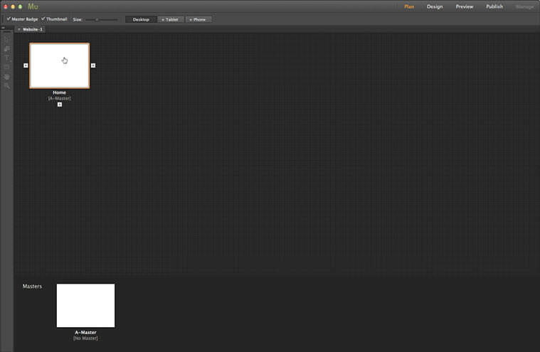
1. Create a new site in Muse.
I’m beginning with a new site here, note the Minimum Height setting has been increased to 1500px. This is to accommodate the amount of space needed for the scroll effects. This can also be adjusted in the Design View by dragging the Bottom of Page Guide down, or simply by adding elements to the content area, where Muse will push the footer area down for us.
2. Open the Home page from the Plan View
Normally, we’d define the header and footer using the Master Page but as this is a simple example, we’ll jump straight onto the Home page and open it in Design View by double-clicking the page’s thumbnail in the Plan View.
3. Create a text frame
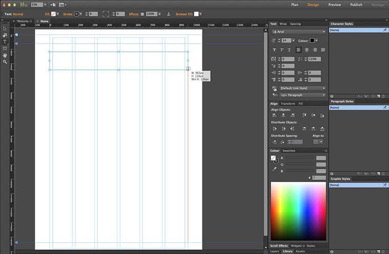
Here’s our page, with not a lot on it. We’ll use styled text frames for our headings, so we’ll start by grabbing the Text tool (keyboard shortcut: T) from the Toolbox. Click and drag a frame from the left edge of the content area, over to the far right of the content area. Don’t worry about the vertical position or the height for now, we can adjust them later.
4. Add text to the frame
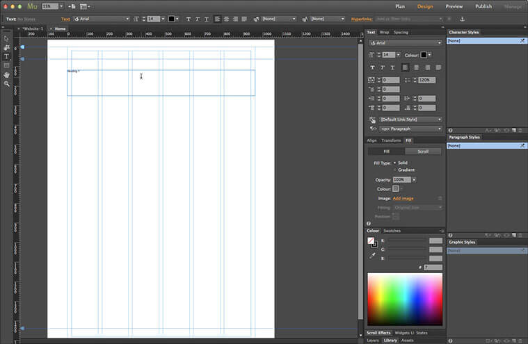
For simplicity, I’m using the text Heading and the section number. Not very original, I know, but it gets the point across. The text is far too small, of course. We’ll fix that in a moment.
5. Select the text frame
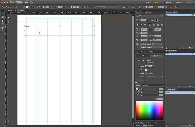
Now we’ll set the styling for our headings. Switch to the Selection tool (keyboard shortcut: V). This should automatically select the text frame but if not, click inside it. We can see the currently active object on the left of the Control Strip.
6. Set the background fill colour
We’ll start off with the text frame’s background colour. This can be set either from the Fill Settings on the Control Strip, or from the Fill panel. I’m using shades of orange here, since they’re in a convenient order in the Swatch panel.
7. Set the text style
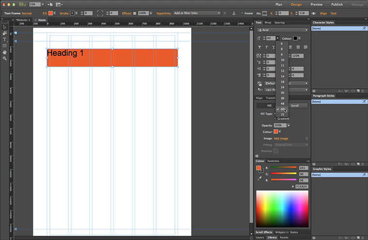
Now for the text. Go to the Text Options on the Control Strip, or use the Text panel. Again, we’ll keep things simple, so we’ll stick with the default font of Arial. We’ll need to make it larger, of course. A pixel size of 60px works well. We’ll also leave the colour as black.
8. Adjust the text frame’s size and position
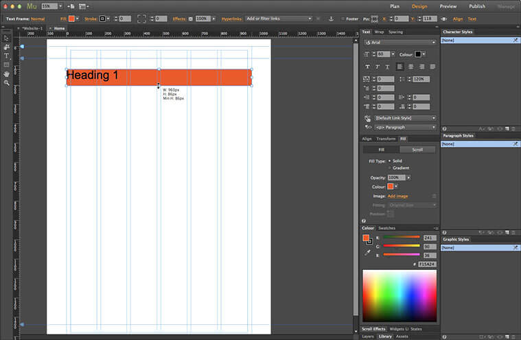
We’ll shrink the frame a little by clicking and dragging the frame’s bottom-middle handle up. I’ve set it to 86px here. Now move the frame up to meet the Header Guide. We can click and drag until it snaps into place, or use the Up Cursor Key to nudge it – holding the Shift key increments it by 10 pixels at a time.
9. Create a new layer
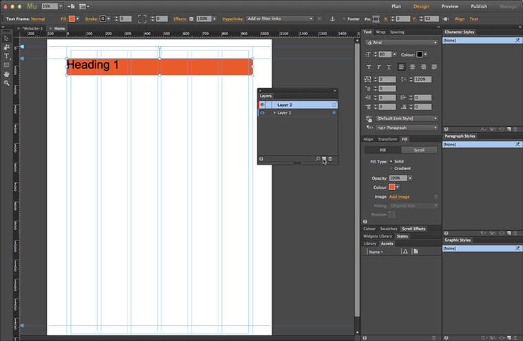
Before we move on, we need to make sure that the headings will appear above the rest of the page content. The best way to do this is to place them on a separate layer. Open the Layers panel. Click the New Layer icon at the bottom of the panel. A new layer appears above the current layer. Note the colour chip on the left, we’ll see how this is relevant in the next step.
10. Move the content to a new layer
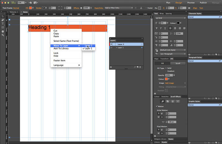
Right click on the text frame, or go to the Object Menu. Select the Move to Layer menu item and click Layer 2. Our text frame has been moved to the new layer; its frame border changes to reflect the label colour of the layer, red in this case. This can be really useful when you have a page with elements on several layers as it helps you to see the hierarchy at a glance.
11. Define the heading movement
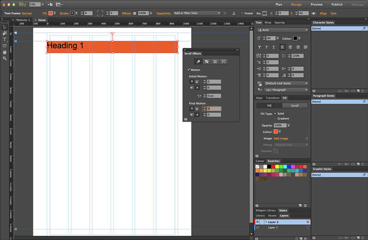
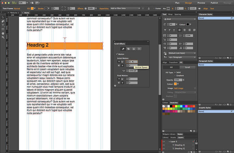
Now we can define the movement for the frame, which, since this is the first heading, won’t actually be moving at all. Open the Scroll Effects panel. Select the Motion Settings – this is the first option denoted by three cascading circles. Change both values for Initial Motion to 0. Set the Key Position to 0 (the top of the page). This can be done by either dragging the T-handle or by typing the value into the field. Set both values for Final Motion to 0 as well. This anchors the frame in a fixed position at the top of the page.
12. Add some content to the section
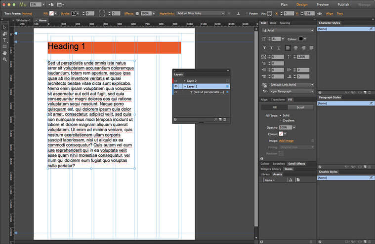
Now we’ll add some content to the page. Go back to the Layers panel. Click Layer 1 to make it the active layer. This will make sure the content sits beneath the headings. I’ve created a new text frame and filled it with place-holder text, just so we have some substance to show off the effect. The pixel size is 30px here.
13. Create a duplicate of the heading and content
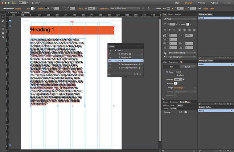
To speed up our workflow, we can create a duplicate of the heading and content frames. Grab the Selection tool. Click the text frame we just created. Hold down the Shift key and click the heading frame. This selects both elements at the same time. Now go to the Edit menu and select Duplicate. We now have a copy of both objects; Muse helpfully offsets them slightly to make it easier to select and move the copies. If we open up the layer contents in the Layers panel we can see that Muse has retained the layer structure with the headings on Layer 2 and the text frames on Layer 1.
14. Change the second heading’s title and background colour
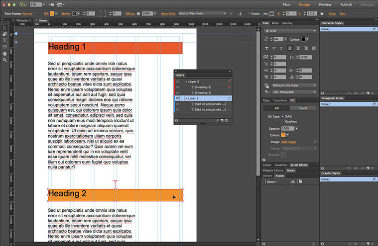
Double-click the new heading frame to make the text editable. Change the 1 to 2. Grab the Selection tool again. Now change the heading’s Fill colour to the next shade of orange in the Swatch list.
15. Set the new section heading’s scroll motion
We need to alter the motion settings for this heading, as we need it to move up as the page scrolls. Go to the Scroll Effects panel. Change the Initial Motion value to 1 px vertical, this will scroll the frame at the same speed as the rest of the content. Leave the Horizontal Movement at 0. Since we duplicated the first heading item, there’s no need to adjust the Key Position, as it will stop in exactly the same position, once it reaches the top of the browser. If we had created the object from scratch, it would have been necessary to work out the position by subtracting 62px – the distance between the position of first heading item and its Key Position – from the second heading’s position . Again, we need to leave both values for the Final Motion at 0 to stick it in place, once the Key Position reaches the top of the browser.
16. Add more content sections
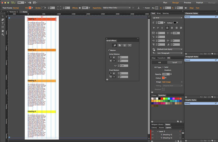
Make a couple more duplicates of both the second heading and content frame as we did before – you can use the keyboard shortcut of Cmd+Opt+Shift+D (Mac) or Ctrl+Alt+Shift+D (PC) to speed up the process further. Change the text and colour, then move them into position down the page (shown here zoomed out to the full page). The correct Scroll Motion settings will be copied as before, so there’s no need to adjust them.
17. Preview the effect
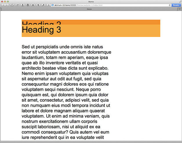
Go to the File menu. Select Preview Page in Browser. All being right, as you scroll the page, the headings will scroll up and stop when they reach the first heading, stacking up on top each time – this doesn’t translate well in a static image! We can see the text scroll past the heading here but ordinarily that would be hidden by the navigation menu or another page element.
That’s the basics of using Scroll Effects to create stacking headings in Adobe Muse. It’s worth noting that there has to be sufficient content on the page to allow every heading to reach the top; short pages may work on a laptop display but the headings may not reach their final position on a larger resolution device.

